Data Science Portfolio
Here we have a growing collection of work I’ve done in the area of data science. I’m on LinkedIn and Twitter. Here’s my resume.
Codecademy Intro to Data Analysis
I recently completed Codecademy’s Intro to Data Analysis Pro Intensive which focused on building real world skills in data analysis, data visualization, SQL, Git, and hypothesis testing. I have a separate repository containing the projects from the course.
The course also included a capstone project involving an A/B Test for a hypothetical gym, MuscleHub. The capstone required analysis and a set of slides for a presentation, and I also recorded a video of the presentation which is embedded below:
The News Unspun
The News Unspun is a project that I began with a friend of mine in February 2016. We set out to solve the problem of unreliable news being passed around. My goal was to create a daily newsletter that contained an unbiased summary of the news that could keep a busy professional up to date in under 5 minutes. The summaries were hand written by a team of writers; twice a day a news aggregator that I built would send an email to the writers.
The project now lives in a website version of the email that would go to the writers. Since we had put the project on hiatus, I’ve been able to increase the efficiency of the aggregator and reduce it’s runtime from about 30 minutes to about 6 minutes, allowing it to run more often so the webpage can be updated more frequently. Coming improvements will include better headlines for each topic and short summaries.
CEO Compensation Analysis
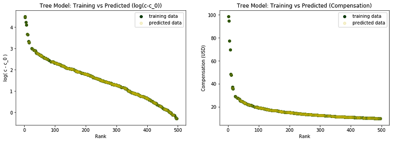
I’ve completed an analysis of CEO Compensation. The project was motivated by a Wall Street Journal article about female CEOs having a higher median pay. I have a write up of the project that is less detailed in Towards Data Science on Medium’s network of publications.

Congressional Partisanship
As a study in visualization with matplotlib and seaborn, I scraped data from the Senate and House websites that listed the members of each Congress and how many seats each party had. The results are written up in the Senate Partisanship Jupyter notebook. There is a short write up of the results on Towards Data Science. You can directly view the Tableau visualization here.
Twitter Bots
I’ve created a couple of Twitter bots that retweet (RT) specific types of tweets. I have a bot that RTs data science and artificial intelligence news (@akdm_bot, currently at just over 650 followers). I also created a bot for a friend’s alternative history podcast (@what_if_history). The bot helped increase his audience engagement and helped to bring the number of followers from between 20 and 40 to around 1150. Both bots are toy projects at the moment and have kinks that need to be worked out. The code is available in my Twitter Bots repository.
Technical Writing
I’m a person who enjoys writing and editing. I’ve been working with Towards Data Science since early January 2018 as an editorial associate. The position entails approving posts on Medium and providing constructive feedback to writers. I became a writer for TDS in early December. Since then I’ve been continuing to write. Some selected posts include:
- Fighting Cancer with Artificial Intelligence: Part 0 — Deep Learning
- Congressional Partisanship: A Visualization
- Female CEOs Have a Higher Median Pay, But Is It Related to Their Gender?
- What’s the Use of All This Data If No One Wants to Look at It?
Tableau Visualizations
Here is a list of my public Tableau visualizations:
- Endangered World Languages
- Congressional Partisanship
- News Source Biases Summary and Breakdown
- Student Growth - Grade 1 - Math
- Where MSDA Grads Go to College
Packt Publishing Free-Learning E-Books
Packt Publishing has a daily e-book that is offered for free as long as you sign-up for an account and visit the Free Learning page. As part of my morning routine, I check my email, so I wrote a scraper that gathers the title of the book and a description and sends an email to a list of users. I have three versions: Free_Book_Scraper.py is the first version that I wrote with an HTML email, Free_Book_Scraper_HTML_color.py is an newer version that included an HTML button with a button that changed color to match the colors of the book, Free_Book_Scraper_html_w_colors.py is the current version that I run on my AWS EC2 instance (if you are interested in joining that list send an email).
Grade Analysis
As part of an interview for an administrative position at a charter school, I took a look at some sample grade data from a Math Test that was taken in September and December and analyzed the results. The write up is anonymized to obscure the names and classes of the students in the sample data set.
Graduate Map
In order to allow future and current families at my current school explore which colleges and regions of the country graduates go to, I created an interactive map that includes the colleges and majors of graduates from 2009 to 2017. The Tableau visualization can be viewed directly here.
